Logo Modernization: EMA (Environmental Management Agency) Zimbabwe. [Case Study]
A logo’s primary purpose is to identify. It’s the face of the company. Taking this into consideration, a good logo is identifiable, memorable, versatile & appropriate.
With time, logos tend to get quickly outdated especially the ones that were designed following flashy trends. Sometimes it’s just because of a bad job by a designer or even the client itself. However in this study, I’m going to present how I would redesign the logo for EMA (Environmental Management Agency Zimbabwe). Please note this is not a real rebrand but a personal study strictly for educational purposes.
Background
EMA was established in 2002 as a statutory body responsible for ensuring the sustainable management of natural resources and protection of the environment, the prevention of pollution and environmental degradation, the preparation of Environmental Plans for the management and protection of the environment.
The current logo is an actual image of a mountainous landscape and a lake below. It’s layout is similar to that of a circular badge. It’s nature makes it barely versatile (designers who have worked with the logo can attest to this) & recognizable as similar pictures are everywhere now in this digital age. One could easily mistake a family holiday picture for the logo.

Concept
The aim of this study is to demonstrate how the EMA logo could be modernized to function seamlessly on screen and print. Emphasis is also put on making the logo identifiable & memorable by maintaining the structure of the old logo.
The Forest, Mountain & The Triangle
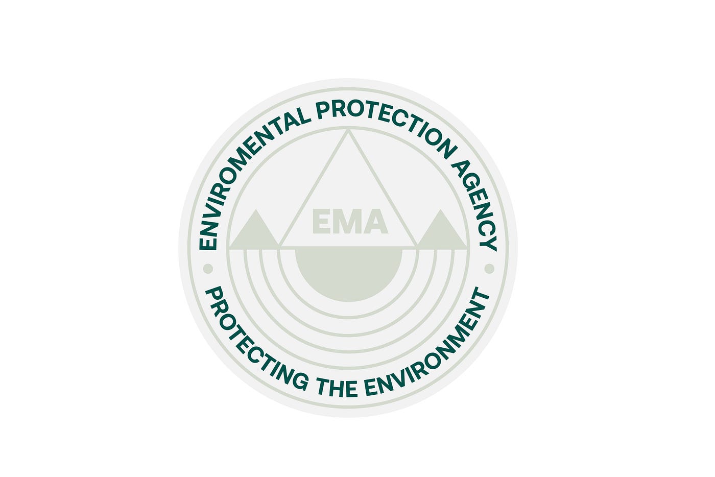
As noted from the current logo design, the picture on the logo features a densely forested mountain. To represent this graphically, the mountain & forest are striped down to the simplest graphical representation, a triangle. A larger triangle is placed at the center to represent the mountain while two smaller triangles are placed at both sides to represent the forestry. The icing on the cake; triangles are often associated with danger warning notifications & what better way to show the protective nature of the Agency than having the striking bold “EMA” enclosed in the middle triangle?


The Droplet & The Ripples.
Water is of paramount importance when we talk of Environmental conservation & to mankind as a whole. Without doubt, it has to be represented as well on the logo just like the old one did. To depict this precious resource, concentric semi-circles are used to depict the water in the form of ripples. Interestingly, the middle triangle comes into contact with the centered solid semi-circle to depict a droplet of water falling into a body of water causing the ripples.


Typography
Maintaining the original form and layout was of paramount importance from the get go. The typography is set to form a circular badge like the original design. The font is bold, clean and professional to evoke seriousness unlike ‘Comic Sans’ used on the current logo. A serious agency that deals with a serious problem like environmental management should seriously use a serious font.
Results
Here is what the final design looks like:


Conclusion
While the final logo is not the best possible solution, it attempts to solve problems created by the current logo design. It is versatile and relevant. It will definitely work well both on screen and print as it can be broken down to simpler forms and even scaled to smaller sizes and still remain legible unlike the current design.
Thank you for reading. Please share your thoughts in the comments below or get in touch with me on stgarikayi@gmail.com
