Getting started in Typeface Design

With thousands of typefaces at our disposal, graphic designers are often faced with the challenge of choosing the perfect typeface for a project. It even proves more difficult when trying to select a unique typeface for a specific branding project. In this scenario, designing a special, personalized font is an ideal way to make the brand stand out from the crowd while giving you, the designer, more design experience to add to your expertise on your graphic design CV. How do you get started in designing your own typeface?

Type Design Brief
Everything starts with a purpose. A type design brief is exactly that, a purpose statement, the “why”, the reason for making the typeface. It should help determine what the typeface should do; Is it for display, long form reading or short headlines? Is the font intended for screen or print? To whom does it speak to? What are the required character sets for the font? What languages does it cover? These are questions you should answer before embarking on a typeface design project. It will guide you to plan effectively and execute all the tasks at hand so that the purpose is achieved.


Type Design Research
One of my favorite stage in the design process. Research is done to align better with the goals set in the design brief. The design brief will act as a guide on what to research on so that you won’t spend time turning the internet and libraries upside-down searching for information. Research in this case includes looking at what has been done before (usually by looking at old type specimens, manuscripts etc) and visually translating the attributes. The discoveries you make will help you in the font drawing process.


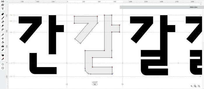
Drawing Characters
The interesting part you’ve been waiting for. While I’m not going to dive deeper into the step by step process of drawing letters, I’ll just share with you an overview of the process and the tools you’ll need to get started. (A later post will delve deeper into the process of drawing individual characters)
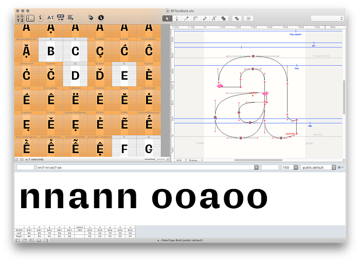
Sketching on Paper — The traditional way! The beauty of first drawing your characters on paper is that you’ll have more control than when you draw digitally on your computer. Character modifications can be rendered easily without much effort (might power of the eraser) and noted can be taken down quickly as soon as a new idea pops up. It’s also easier to compare and contrast individual characters side to side. Most important, all you need is a pencil, eraser, and paper.
Digital sketching and drawing — It’s getting real now! Some designers love to start straight away digital, myself included. Though it has it’s disadvantages eg lesser control when drawing characters, it is a bit faster than sketching on paper first and scanning into editing software. I usually sketch in Adobe Illustrator and move on to Fontlab Studio where i’ll redraw the characters and do the font development process. Here are some of the available Font Design Softwares you can use:
- Fontlab Studio VI is a used for professional font design and it is used by many leading foundries and font engineers for its solid design and engineering tools. The software has a steep learning curve for the newbie, as there’s a powerful range of tools here to get to grips with. However, the useful tools that make this a step up from entry level tools include class kerning to deploy kerning values economically; TrueType hinting tools to improve on-screen rendering; an integrated OpenType feature coding panel; far superior font blending tools (a process known as interpolation) and much improved drawing and scaling tools. Building fonts here allows the designer greater engineering freedom. You can create each font’s name table (and amend it), group fonts as a family, specify vertical metrics, add hint data, indicate Unicode codepages and so on. You will no doubt need to read up on many aspects of the font engineering process to build a worthy and reliable font file.
- Glyphs (Mac only) offers up a comprehensive workflow with a vast array of tools and the ability to build a full family of weights and styles within one source file, which is a huge bonus. It’s built on familiar UI principles with many of the shortcuts for the tools being the same shortcuts you would use in Adobe CC. Glyphs manages to make complex tasks and tools feel intuitive from the outset, and you have the ability to go as deep into this app as you want to. This is probably the most automated app on the market, but you can also take control and define your own preferences by way of using Custom Parameters. This is a well supported app with weekly cutting edge updates, as well as online tutorials and a forum community to help with any questions. The app also includes a plug-in manager, where you can add new tools to the UI with one click.
- Robofont (Mac Only) was built with scalability in mind and is arguably Glyphs’ main competitor. Built on Python, Robofont encourages some scripting and an awareness of Python is undoubtedly beneficial but by no means essential. One important thing to note is that you’ll need to invest in further tools to carry out other essential tasks such as kerning, and if creating a font family of more than two weights you will need a tool for interpolation.
While these are the most popular type design softwares amongst type designers, there are other softwares available that you can experiment with e.g FontForge, Fontographer, Glyphs Mini, Fontself (Adobe Illustrator & Photoshop Plugin), and TypeTool.
Font Development (Engineering)
You’re done with drawing all the characters? Well the battle is not won yet! Creating professional fonts is about so much more than just designing the letters. It requires technical expertise and testing. The font engineering process comprises of:
Font Mastering: checking the technical quality of the outlines. Cleaning up common outline errors, fix path directions, correct overlaps, and adding missing extreme points while interfering as little as possible with the appearance of the letters.
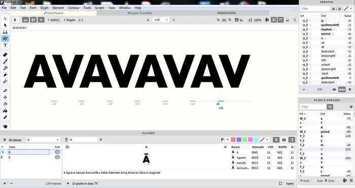
Spacing and Kerning: Optimizing the space around single glyphs and the space between glyph pairs
Glyph Repertoire and Character Set: Checking a font’s character set consistency is essential. That makes it easy to check a font for all glyphs’ uppercase variants and the required code-page coverage. Analyzing which languages are supported is also indispensable. This includes determining the perfect default glyph repertoire for future projects using the database and information provided by different specifications and resources, such as the Unicode Consortium, the ISO, and companies like Adobe, Microsoft, and Apple.
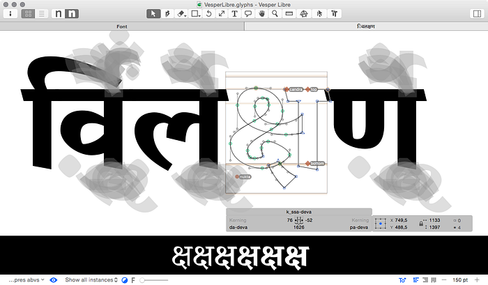
OpenType Features: The advent of the OpenType file format has made injecting a multitude of stylistic variants into a typeface almost trivial. The challenge is making such alternates easily accessible for type users. Simple substitutions can end up in stylistic sets or with some programming chops put directly into the font change contextually. In complex writing systems like Arabic and various Indic scripts, for example, OpenType features are mandatory.
Weights: Starting from the concept of interpolation in type design, developing comprehensive digital type families based on two or more font masters is fairly straightforward. This is basically the generation and creation of various font weights from Extra-thin to Black.
Hinting: Whether a font will be used in print or on screen, hinting is an integral part of the design. By consciously setting up alignment zones, stem values, and instructions, it’ll enable the typeface to look great in all environments.
Font Production
This is probably the last step in the font design process. It includes naming the typeface and generating the different file formats that are needed be it OpenType, TrueType, Variable Font, Color Font, Web Font etc. The truth is the process is never finished, you’ll always revisit your finished typeface from time to time making minor changes and you’ll have to release updated versions of your font family.
There you have it! You’re now equipped to embark on a journey to create your first font. Type design can be very challenging and it demands a lot of patience and careful attention to detail but with the right mindset and determination it can be a joyous ride and nothing feels great like testing out your very first working typeface. So what are you waiting for? Go ahead and create your first font!
Did you like this article? Have something to add or subtract? Share your thoughts in the comments or get in touch with me via Tweeter or email on stgarikayi@gmail.com
References & Resources:
Font Engineering, https://www.alphabet-type.com/fontengineering/
OpenType Features: http://opentypecookbook.com/
